Mobike UI Edit
Optimizing the current English version of the bike sharing app, Mobike.
Optimizing the current English version of the bike sharing app, Mobike.
Mobike is the world's largest bike-share operator with Shanghai being the world's largest bike-share city.
Objective
To improve upon the existing Mobike user interface and UX writing. As the expat population in Shanghai continues to increase, the need for an English app with good UI writing also becomes needed.

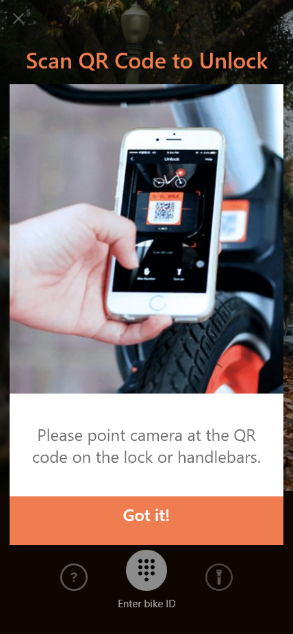
Original on the left, my edit on the right.

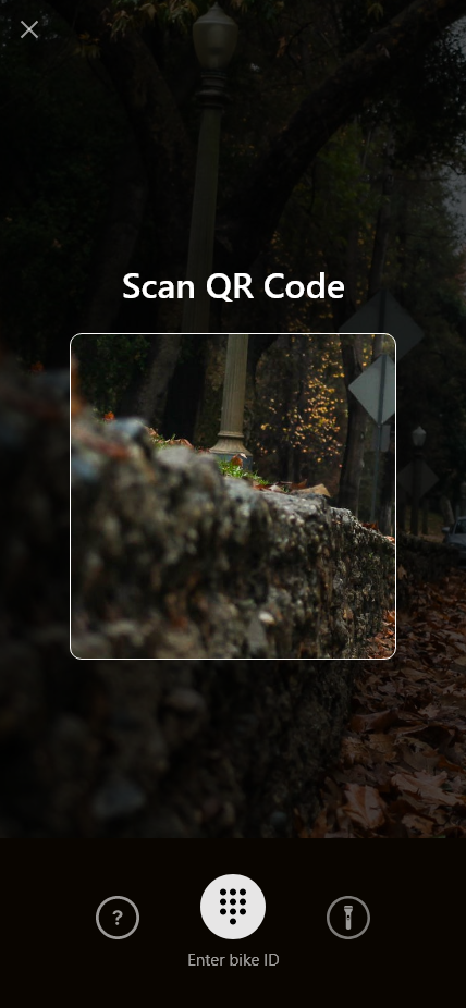
Original on the left, my edit on the right.

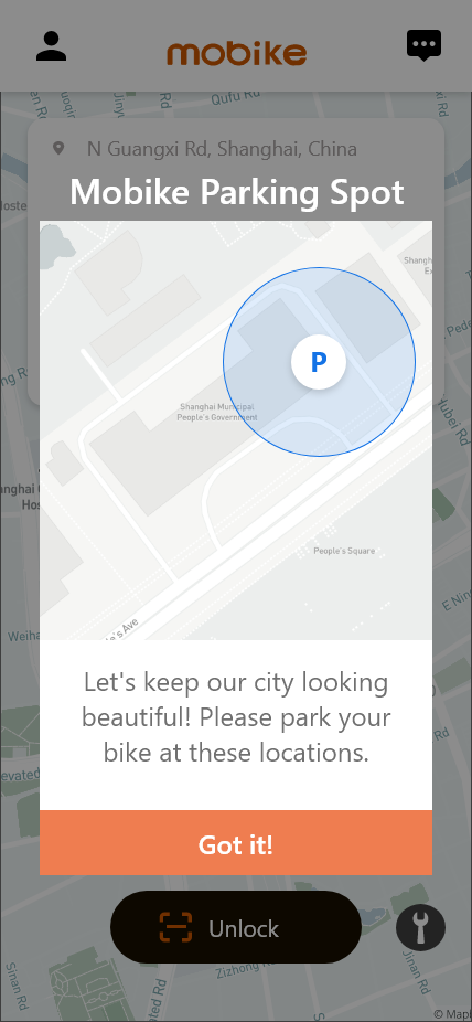
Original on the left, my edit on the right.

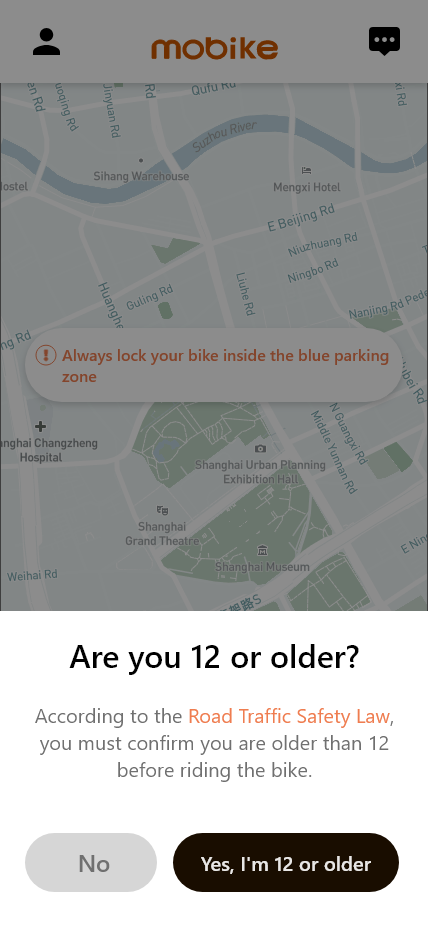
Original on the left, my edit on the right.

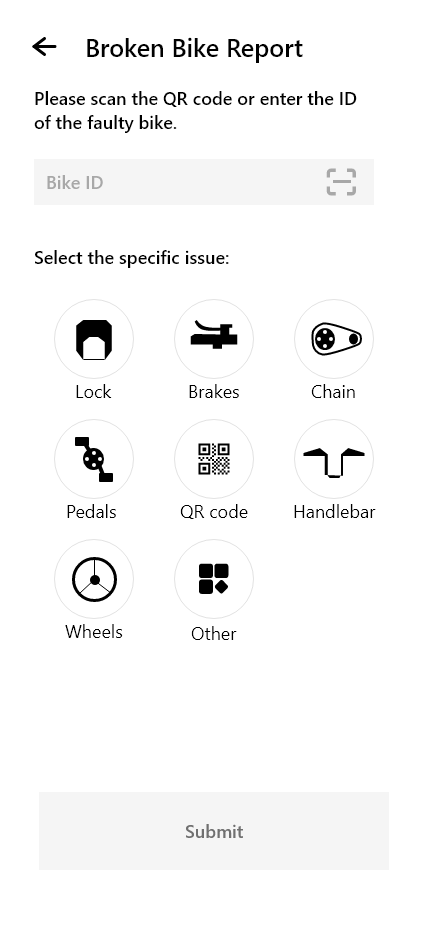
Original on the left, my edit on the right.